
Overview
By doing research, I saw a potential problem in users that were planning to move to a different city or neighborhood. Even though they knew where to look for residences, they didn't know where to get relevant information about the different neighborhoods.
Learn how people are currently dealing with the task of choosing a new neighborhood to live in. I want to find out how they gather information and how difficult and time-consuming this process is for them. Finally, create a product that can make the process easier and less stressful for the users.
A website that has all the relevant information about the neighborhoods in the US and that is easy to navigate. It also allows users to make comparisons between different neighborhoods.
UX and UI designer
Feb - June 2023
Research, user & task flows, wireframes, visual design, branding, test, prototype.
Background
Goals
Solution
Empathize
Design Thinking Process
Define
O1
01 EMPATHIZE
Research Objectives
Role
Time
Tasks
Ideate
O2
Prototype
O3
Test
O4
Understand the reason why the people move to another city, country or neighborhood.
Determine which are the resources that people are using to get to know the different neighborhoods.
Learn about the things that the people are prioritizing when deciding a neighborhood.
I applied two research methods. I started with a competitive analysis of three websites that the users use when looking for neighborhoods and then I did 5 user interviews to different people that have experience a move to another city or neighborhood in this past year.
Competitive Analyisis
Zillow
Pros: Clear map with boundaries and filters with information. Information of schools and. walk, bike and transit score.
Cons: The information of the neighborhood is limited to three aspects. It doesn't make a comparison with prices of the neighborhoods nearby.
User Interviews
Qualitative Analysis
Neighborhoods
Pros: Clear map, reviews, general overview, school rankings and real estate options.
Cons: There are just a few neighborhoods with reviews. The information of the things to do or visit in a neighborhood is in a place were you could barely see it.
I organized the information gathered from the interviews using two different affinity maps, with qualitative and quantitative analysis, which helped me gain insights into the resources utilized by individuals and identify the pain points associated with their decision-making process.

The users felt they made the decision in a rush without much information because they didn’t know where to get more information about the neighborhoods. They didn’t just look for facts, but also points of views.
Some users hired external help because there is not enough information about the neighborhoods. Also, they needed a person that gave them another point of view of the houses and neighborhoods. They felt lonely in the process.
Insights
Quantitative Analysis

Insights
Most of the people prioritize in a neighborhood to be close to parks, to have walkable areas, grocery stores and good access to freeways because that affects their daily routine.
A few people prioritize in a neighborhood to be close to fitness area and cultural events, because they have the time and motivation to participate in different activities.
Some people prioritize safety when searching for a neighborhood. Also, having coffee shops and good schools nearby because they have kids that are in the age of going to school or close to that age.
02 DEFINE
User Persona

HMW #1:
How might we help people that don’t have much time to choose a new place to move in, to make an efficient research about the different neighborhoods?
HMW #2:
How might we help people that feel lonely in the process of moving to a new place, to have enough points of views that help them make a right decision of choosing a new place?
HMW #3:
How might we utilize some data of the US neighborhoods from different websites to make it easier for the people to do some research?
03 IDEATE
Best neighborhoods
Pros: It is very completed the data of every neighborhood in the US. It compares the home rent prices with other neighborhoods.
Cons: Map is not clear and doesn't show boundaries. Doesn't include reviews. Visually hard to read the information.
Brainstorm the Solution
I engaged in a brainstorming session, employing two distinct techniques - analogous inspiration and playing with opposites - to generate numerous solutions. As a result, a wide range of ideas emerged, with a common thread among them: the incorporation of a filtered map highlighting key neighborhood attractions, user reviews, and specific information pertaining to each locality.

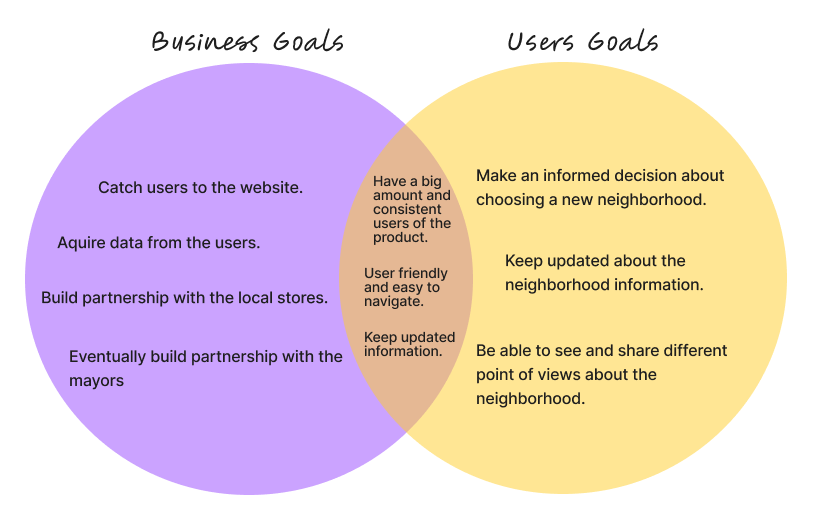
Solution and Goals
I decided to move forward with the concept of developing a user-friendly website that encompasses comprehensive information about neighborhoods across the United States. The website will offer easy navigation and provide users with the ability to compare neighborhoods side by side.
After thinking in the solution, I started thinking in the business and users goals to be sure that the product is useful either for users and for business.
Structure of the Website
The first thing I did to organize the structure of the website, was a Roadmap with the things that the website “must have” and would be “nice to have”. After that, I did a card sorting exercise in Optimal Workshop. Asking people about their opinion in sorting different topics into categories made me feel much more confident about some of my decisions and also changed some of them.

Card sorting exercise
Finally, I did a site map that helped me to visualize how the structure of the website would be. At the end I didn't do it exactly like this. After going into more research with the “group crits sessions” in Designlab, I ended up adding some features and taking away some others.

Sitemap exercise
User Tasks & User Flows
I selected 3 tasks to determined the user task and show the actions the user does to complete the each one. The tasks are the following: Browse a neighborhood, sign up for a newsletter and compare neighborhoods.

I did three different flows to show the different paths the user will need to take to complete the determined tasks.

04 IDEATE
Low Fi & Mid Fi Wireframes
I started sketching the website by doing the Lo Fi wireframes in Figma for the three tasks that were selected.

Next Steps

Style Tile & Component UI Library

High Fi Wireframes
I made all of the screens in the mobile, following the "mobile first" approach, that were needed to complete every task.

05 Test
Prototype
I design a prototype in Figma to be able to test the product with different users.

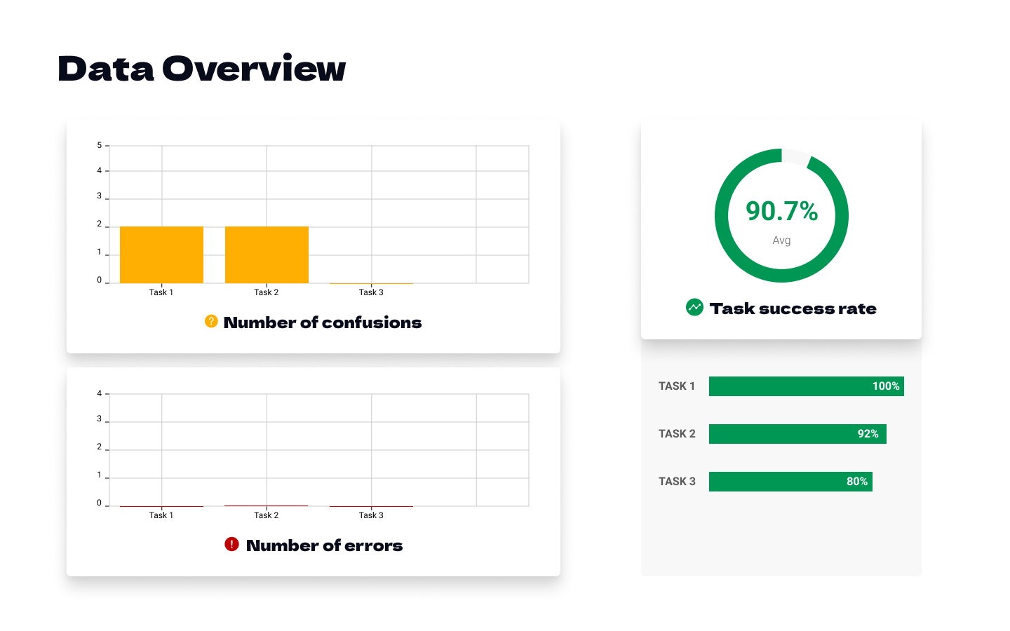
Usability Test
I made a Usability testing in person to 6 participants. Then, I analyzed the results, considering the three tasks that the users when given to do.
Even though there were no errors in doing the tasks, there were some confusions and recommendations.
Overall, the product was a success. All of the users found it very useful and easy to navigate. They algo liked the colors and the visuals of the website.
Iterations
In the homepage screen I moved the "Compare neighborhoods" feature on top of the "Our Purpose" section because that was more important for the user, and some of them want to do that before getting to the neighborhood page.
Also, the “Our Purpose” section was changed for an animated carousel because the other way was distracting for the user.
In the "Neighborhood Page", I removed a carousel of information on top of the map because it was confusing for the user, they looked like map filters. Also I changed the information of the bike score, walk score and transit score to be clearer.

Final Design
I feel very confident about the usability and visuals of this project. I would love to put it into practice and be able to develop it.

Test the product again.
Analyze which are the features that are the most used between users and the ones that are not used at all.
Build a partnership with the mayors and local stores.
Research Methodologies
O5